gold & grey

by Burlesque | John Baizley

“Based on John's original artwork for Baroness' brand new album of the same name, not only is this arguably the finest art print we've ever had the honor of working on with John, but in the 10+ years we've been collaborating, this is the FIRST full-color single print we've ever produced of a Baroness album cover!”

Printer’s Proof #9/12

24 x 34"
16 color screenprint on Crane Crest Fluorescent White cotton paper

Screenprinted by Ben LaFond


desperation burns

by Burlesque | Marald Van Haasteren

“Originally created as part of the artwork for Baroness'Purple album, "Desperation Burns" is our debut print from Leiden, Netherlands-based artist Marald Van Haasteren. Haasteren and John Baizley worked in tandem to create all of the artwork featured throughout Purple's packaging. The two then went on to display all of those original drawings this past weekend as part of their "Desperation Burns" art show in our own CO Exhibitions gallery.

We produced this beautiful beast of a print and debuted it at the art show opening. We can't think of a better way to kick off our creative collaborative relationship than with this one!”

19.75 x 27.5"
20 color screenprint on Crane Lettra 100% cotton Ecru White 100# paper
Signed, embossed, and numbered edition of 164 prints

Screenprinted by Ben LaFond


wake now, discover…

by Burlesque | Ben LaFond

“After spending a solid four hours from 2am to morning twilight yelling obscenities at the sky while watching a glorious display of Aurora Borealis on the North Shore of Lake Superior, I stumbled down to water’s edge to welcome the sunrise. Upon arriving at the beach, the birds were stirring with activity, the lake was pushing its perpetual waves towards the shore, and the early spring melt had just begun to send winter’s runoff down the creek and back into Superior’s arms. I had this entire beach to myself and was still reeling from the evening’s northern lights display, in total awe of the beauty the universe continued to put in front of my eyes. As I strolled the edge of the lake looking for rocks, my eyes caught a glimpse of a small puddle that had frozen just enough in the chill of the evening. Just as the sun was cracking the horizon, the reticulated patterns in the ice revealed themselves in perfect light.

This print was created with six screens and a few press sorcery backflips. It features CMYK, a clear gloss spot varnish, and a very subtle translucent metallic shimmer applied to the ice. The subtlety of the print’s special effects is difficult to capture but it will surely be a treat for your eyes in real life!”

16 x 20"
6 color screenprint on acid-free, archival white paper
signed + numbered edition of 50 prints


malala

by Burlesque | Wes Winship

Tribute to education and human rights activist and international icon Malala Yousafzai.

Printer’s Proof # 4/5

18 x 24"
3 color screenprint on French Whitewash paper
Screenprinted by Sarah Schatz

A portion of the proceeds from the sale of this art print will be donated to Malala Fund.


cool city stuff

by Burlesque | Mike Davis

Grab yourself a one-way ticket to COOL STUFF CITY, a major municipality with everything you need and nothing you don’t. A booming community of video games, noodle shops, records, snacks, neon signs, playing cards, books, and more Easter eggs than you’ll know what to do with, all designed by Mike Davis.

18 x 24"
7 color screenprint on acid-free, archival white paper
signed + numbered edition of 76 prints

Screenprinted by Sarah Schatz


golden rule

by Studio on Fire

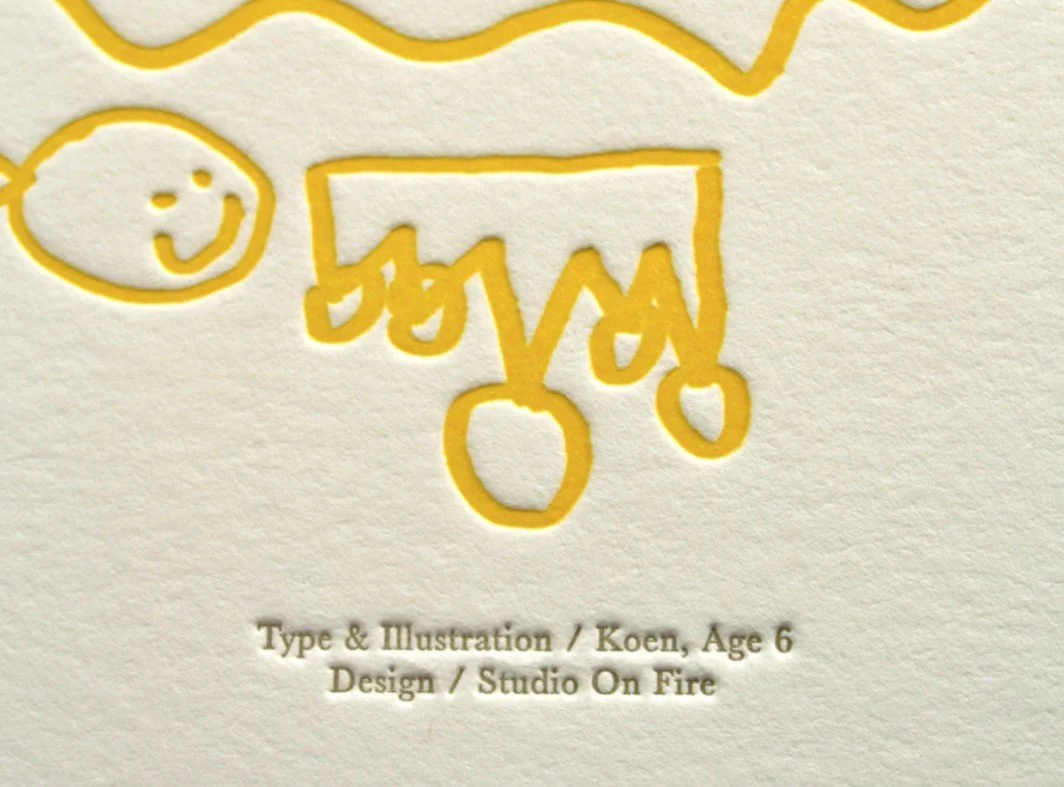
The Golden Rule is the principle of treating others as one wants to be treated, this version is illustrated by a child, implying the stage in life by which we hope everyone learns this rule.

15 x 20”
Letterpress printed on 220# Crane Lettre Pearl White with two inks. Type & illustration by Koen, age 6, designed by his dad, Ben.


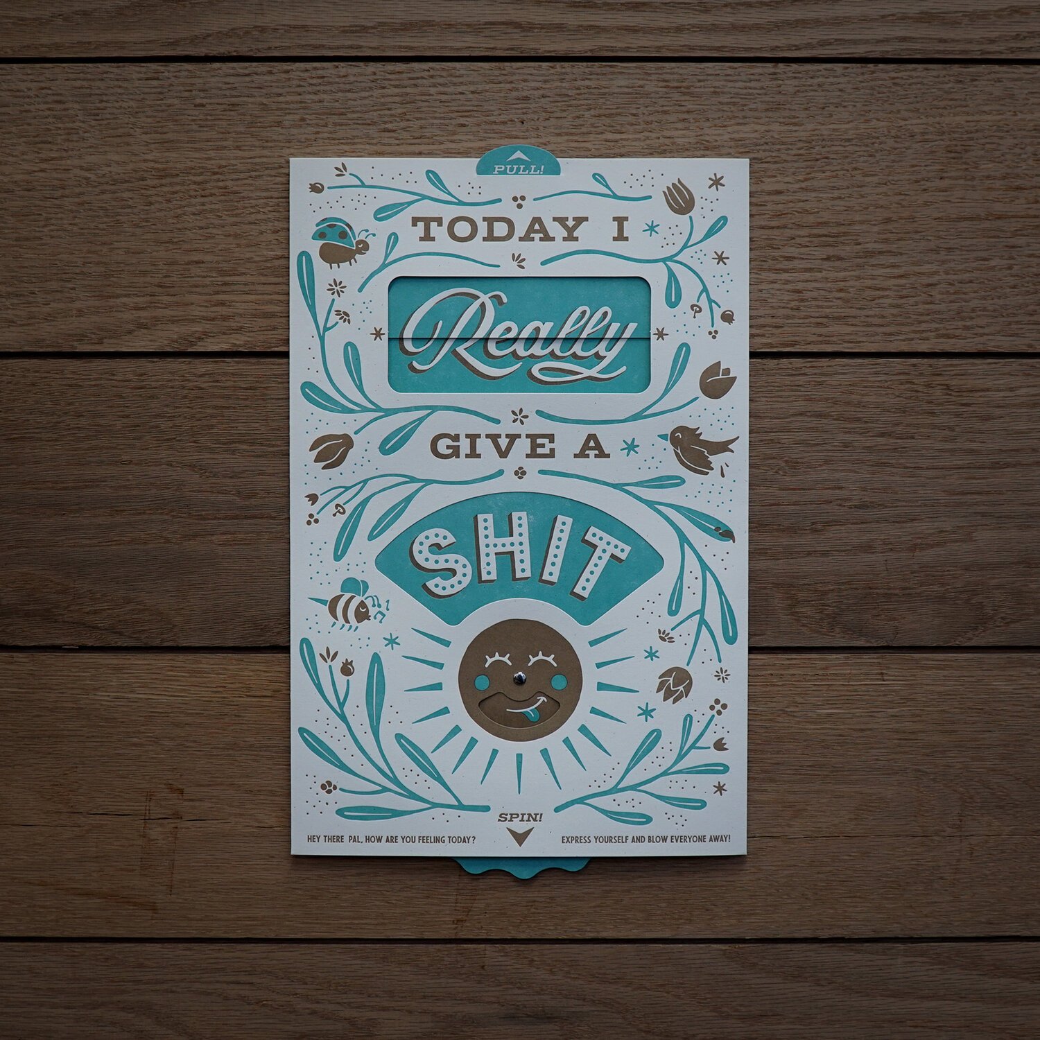
Give a Shit Interactive Print

by Studio on Fire

Express your every emotion with Studio on Fire’s interactive feelings print. What’s your mood? Letterpress printed with 2 inks on 100# Speckletone Madero Beach.

8.5 x 14”
Letterpress printed with 2 inks on 100# Speckletone Madero Beach.


wildflowers of minneapolis

by Studio on Fire

Inspired by vintage botanical prints, this poster features some of the beautiful plants and wildflowers that can be found in Minneapolis parks.

18 x 24"
Printed with one bronze foil on a creamy speckled French paper stock.


antler park

by Studio on Fire

A celebration of Midwest wildlife and the best park activities. Studio on Fire used one of their favorite local animals as the backdrop to some of our favorite things to do in Minneapolis parks. Oh, and they made all the characters gnomes, because why wouldn’t they.

18 x 24"
3 color letterpress on 18pt Mohawk Loop Milkweed cover


power of love

by Studio on Fire

“When the power of love overcomes the love of power the world will know peace.”

-Jimi Hendrix

18 x 23”

Letterpress printed with 3 inks on 110# Crane Lettra in Fluorescent White.


TATER TOT HOT DISH

by Studio on Fire

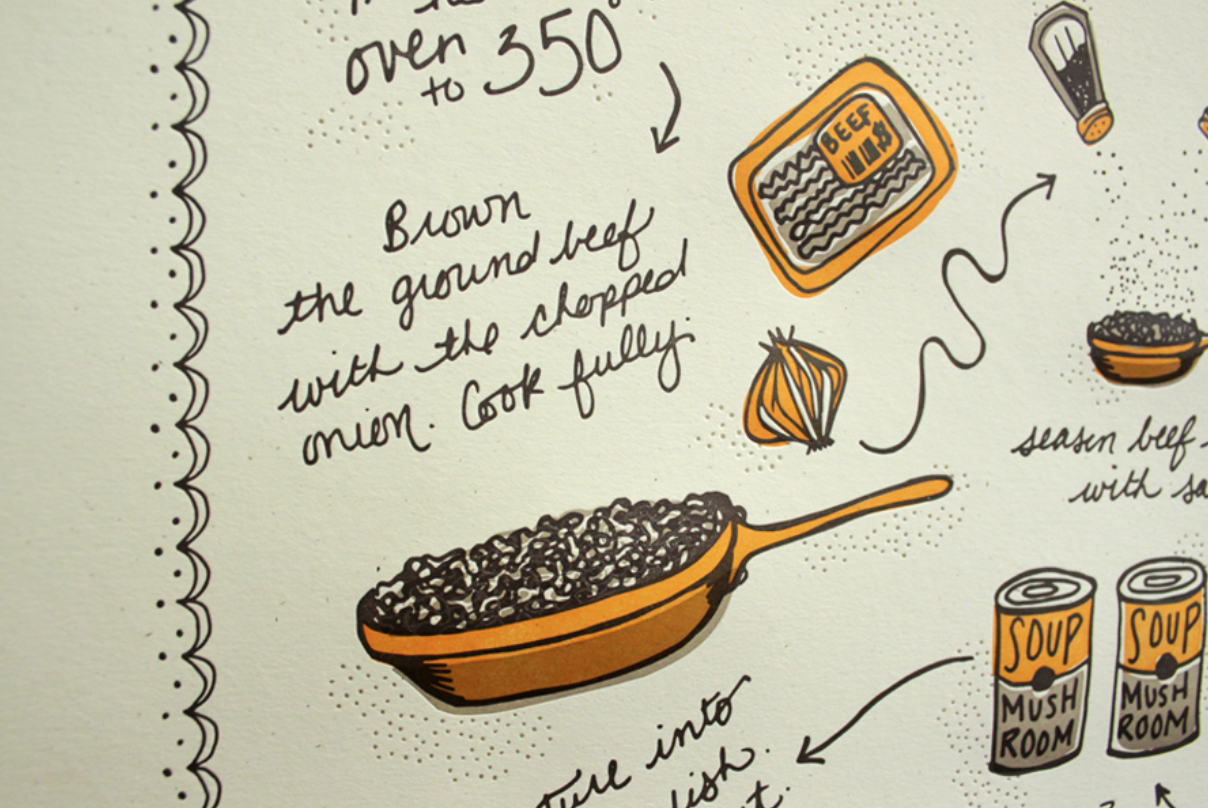
Nothing is quite more Minnesotan than hot dish (what some non-locals might refer to as casserole) and no hot dish is more beloved than Tater Tot Hot Dish. Every family has a different recipe and no two grandmas will ever agree on the proper way to cook it, but it's a classic all the same. Studio on Fire created a poster to share a recipe that is easily adaptable for any taste preferences.

18 x 24”

Letterpress printed with 3 inks on 160#Mohawk Antique Vellum Milkweek


on tap daily

by Studio on Fire

Bring a little positivity to your drinking decor

18 x 24”

Printed with 1 foil tamp and 2 letterpress inks on 100# Neenah Classic Crest Pewter


billy strings, st. paul

by LandLand

Designed for the Billy Strings show at the Palace Theatre, November 2021.

24 x 36”

screenprint


primus, pittsburgh

by LandLand

"Primus is one of those bands I've loved pretty much as long as I've been into music...before posters, before I knew any of you, before I could even drive. Catch me in person sometime and I'll tell you about the first time I ever set foot in the Bay Area as a dorky quite kid, sorta held hostage in the cargo hold of a station wagon on a road trip with my dad's other family, armed only with a crappy off-brand Walkman and one cassette to escape into... I'd known we'd be going thought the stomping grounds of some of my favorite bands, so it was a dubbed copy of Greenday's "Kerplunk" on one side, and "Pork Soda" by Primus on the other side, and a shitty car ride through California turned into a scavenger hunt of side-mentioned landmarks: "Where's the San Pablo Bay?" "Is Christie Road a real thing?" "Am I gonna see a Checker Gas, or the DMV?""

18 x 24”

screenprint


foo fighters

by LandLand

In May 2021, Foo Fighters reached out to Land Land to design a poster for their tour that brought them through First Ave. This is the result. "This was a super fun thing to work on, and I'm really excited about how it turned out. I made the drawing on clayboard, and then Jessica Seamans clocked in to help out with her watercolor work, and Rebecca Sunde and I printed them as a seven-color screenprint right here in our studio."

18 x 24”

screenprint


katamari damacy

by LandLand

“Hey! I’ve made a new thing! Here’s my poster for the wonderful game KATAMARI DAMACY…”

18 x 24”

screenprint


phish, san francisco

by LandLand

Created for Phish’s San Francisco shows in October. “This whole process was super fun from start to finish…Jes and I teamed up on the art, as we do, with me working on the initial sketch and the final illustration, she tackled the lion’s share of the color work (both of us working analog at this point), and then at the end we merged everything together and I handled a little bit of color finessing before getting it all broken apart to be screenprintable.”

18 x 24”

screenprint